Project background
While planning a vacation with friends, I noticed significant changes in the UX/UI design of booking websites. Many new features were useful, though some were confusing. As a UX/UI designer, these observations intrigued me, suggesting a significant changes in the industry. Inspired, I decided to redesign the Agoda website to provide a better user experience in this red ocean market.
Role
UX Research & Design
Service Design
UI Design
Design process (Duration : 2 weeks)
Discover
How I transform Agoda by addressing overlooked high-Impact areas that could
lead to an exceptional user experience
Throughout the design process, we will go through four phases: Discover, Define, Develop, and Deliver
This part may get a bit messy and all over the place, but that's our intention. We aimed to dive into a vast pool of unpolished information, exploring and uncovering everything within it
We start by exploring the context broadly, gathering foundational insights on customers and users
Secondary Research

Research : 2 Weeks
Design : 1 Week
These phases will help us
uncover insights
identify the real problem
ideation of solutions
redesigning the user interface

Agoda's customer base is evenly split between males and females, with the largest age group being 25-34 years old, comprising 30% of the total. This suggests that the majority of customers are
tech-savvy and financially capable of traveling
Demographic
MBTI (Types and Behaviour)
Trends


#04 Last-minute Bookers
who do last-minute bookings by taking advantage of flash deals
#02 Luxury Travellers who prefer high-end accommodations
Agoda's users can be categorized into four MBTI, ranked from most to least common :
#03 Long-Term Travellers who seek extended stays and long vacation
#01 Budget-Conscious Travellers
who prioritize competitive pricing
Demand is growing for experience-based travel
with personalized packages
A trend towards ‘Budget-conscious luxury’ trends where people allowing themselves to spend on luxuries or upgrades item while maintaining a budget-conscious trips
There's a shift towards spontaneous travel
with minimal planning
and flexible itineraries
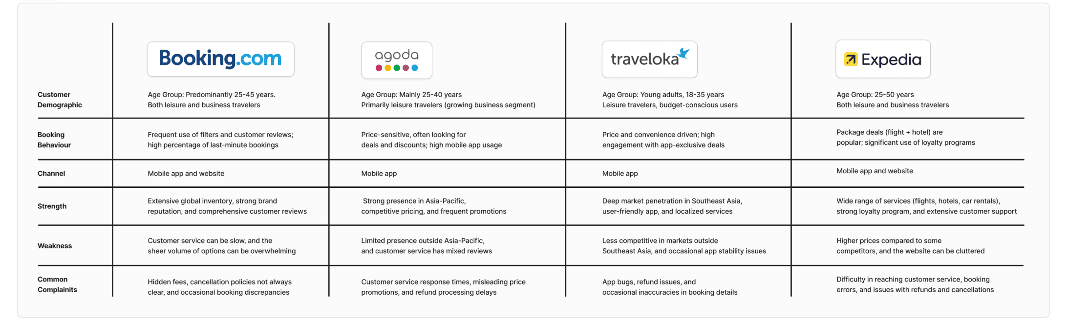
Next, we analyze and evaluate how each company interacts with customers/users, including their strengths and weaknesses
Competitive analysis
Take away:
Consumers prefer Agoda, Traveloka, and Expedia for competitive pricing, and Booking.com for a wide
Despite each platform's unique strengths, they share common weaknesses, including information transparency,
price discrepancies, and poor customer service. Improving these areas could differentiate a company from its competitors tremendously
After gathering comprehensive insights, we try to uncover prominent patterns
in user challenges and their primary concerns
Pattern framing
After gaining a comprehensive understanding of Agoda's users, we took on the role of customers to personally engage with the services, observe and conduct customer journey mapping to visualize the interactions throughout the whole journey
Service safari and Customer journey mapping
Insights from various platforms and resources can be overwhelming, but they reveal common user feedback shared across each platform, highlighting the mutual challenges users face during their booking experience and the most frequent challenges mentioned are related to the information presented and customer service. Meanwhile, there are also notable issues alongside user experience challenges


selection of properties. For formal trips, websites are favored over mobile apps due to easier itinerary management.
The experiment showed inconsistent emotions primarily due to the overwhelming and messy visual
hierarchy and content, time-pressure task, disjointed experience, and poor customer services. I also observed that interactions can be grouped and classified into three phases: Before, During, and After Booking/Traveling, each with different levels of urgency and impact on customer experience
At the end of this stage, we pieced together all the information and were able to form a thorough understanding of 'Agoda booking services' from both a researcher's and customer's perspective. A recurring pattern I noticed are the issue with presented information and customer support that have surfaced across numerous methods and resources I've used. However, the next stage will provide us with an opportunity to go deeper and figure out more on the problems
Discover: Key takeaway
Define
In this stage, armed with our gathered treasure of users information, we will now dissect and synthesize it to uncover what lies under these treasure and the underlying actual problems
After understanding our users, we organize and categorize data into patterns to identify their experience landscape and pain points
Affinity diagram


In addition to gaining a clear and visual representation of user archetypes, I also discovered an interesting insights (or hypotheses) suggesting that age and occupation significantly contribute to the experiences and interactions between people and the platform. For example, young adults often question the accuracy of the provided information, while middle-aged and older adults are more concerned with the platform's inclusivity, ease of use, and availability of help when needed
We create a fictional character to empathize with users’ behaviour, needs, and identify the actual problems and opportunity
User persona

By the end of this stage, after gathering and synthesizing our insights and understanding our users and their pain points, we can confirm that the issues identified during the discovery stage are accurate. And here is the problem statement we have concluded:
Define: Key takeaway
People view travel as a regular reward throughout the year rather than a rare event. There's a noticeable shift towards travelers preferring options that enhance the emotional value of their trips, not just functional factors. And users also prioritize a seamless, user-friendly booking platform for smooth transactions and reliable support services.
However, users' pain points such as information accuracy, customer support, platform usability, and brand credibility affect user impressions and loyalty toward the brand. Agoda's most significant challenges, especially 'information accuracy and customer support,' have the greatest impact on user experiences. These issues are also widespread and common across the booking services industry
. The information provided
are not transparent, accurate,
and clearly stated
Customer support and services
lack accessibility, reliability, and responsiveness


Develop
In this stage, after identifying the actual problems, we began questioning, ideating, and strategizing on how to address them
We transform a specific problem statement into an open-ended questions and explore and propose a wide range of ideas and solutions as thoroughly as possible
How might we and Brainstorming
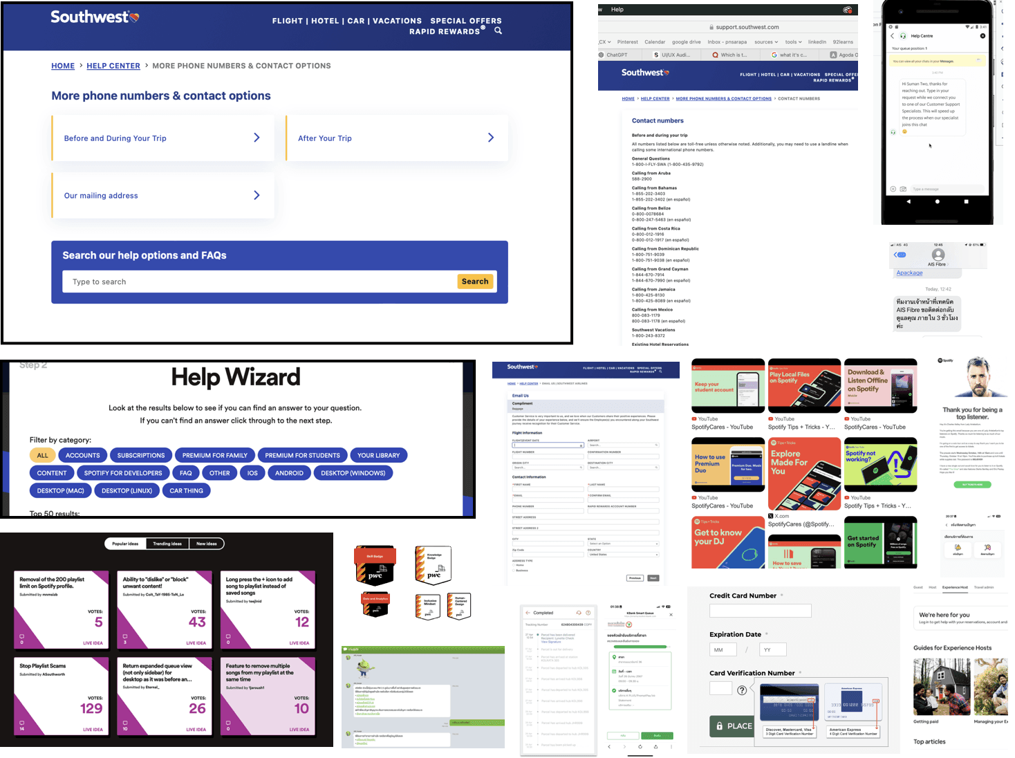
In addition to brainstorming on my own, I find it beneficial to research real-life cases that address similar issues to see what works and what doesn't
Case study

This is the exciting part where I get to explore how others are dealing with similar issues to ours, by researching across all different industries. Which later on, I analyse their ways of thinking and strategies and use it as an inspiration for our potential adaptation, innovation, and solutions
Not all ideas are practical. This priority matrix helps determine which ideas to execute 'now,' 'next,' 'later,' or 'never.' As you can see, some ideas fall into the Low Effort-Low Impact area. This process is crucial because, while brainstorming, everything may seem like a good idea, but eventually, it might not be worth the resources
We prioritize the ideas based on their impact and feasibility
Priority matrix

Information architecture and User flow


Now that we know what to do and what our solution involves, we decided to use 'Information Architecture' to create a structure that implements those solutions at the appropriate touchpoints. We also use user flow to ensure that the designed process leads users to complete tasks seamlessly and successfully
Deliver
By the end of this stage, we have developed a solution that addresses the issues of 'Customer support and services'
and 'Information transparency and accuracy.' We have also strategized a structure and flow with these ideas implemented
Develop: Key takeaway
In the earlier stage, we crafted our valuable tools. Now, the challenge is to refine and implement them in practice and bring them into the real world
First, we quickly generate and communicate layout and content ideas through low-fidelity visual representation of the product or interface while also review existing interfaces to identify and analyze touchpoints that need improvement
Paper wireframe

We refined and polished visual design and content, emphasizing crucial design features and interactions
Hi-fi prototype
At first we started at Agoda’s home page, since it plays a crucial role in attracting, retaining, and converting visitors into loyal customers and act as the main page that users visit when searching for anything, it's essential to include all important features that meet their needs
We have developed and implemented solutions at each touchpoint that will most effectively address the issues of .
'Information accuracy and transparency' and 'Customer support and service,' along with additional improvements


and as you can see we primarily focus on adding new features to enhance information transparency and provide both direct and indirect support channels to customers while also redesigning the visual hierarchy and content for a better user experience as well. Next, we will focus on enhancing the property detail page to improve information accuracy and provide better


access to customer support. To address these issues, we will add an 'Approved' badge and the 'Agoda Assist' feature. The 'Agoda Assist' feature is inspired by the 'KBank Live Chat' user experience and service model, which we hope will significantly improve Agoda’s customer support reliability and responsiveness tremendously the same way as they did for Kasikorn Bank.
On the property detail page, we added a 'Review Type' feature to boost credibility and transparency. This helps users make informed decisions and shifts the approach to negative comments from deletion to addressing and improvement.


To encourage customers to solve issues themselves while improving Agoda's customer support, the Agoda traveler community is a practical solution. It allows users to contribute to changes, providing insights for enhancing user experience and creating a sense of belonging


Finally, and most importantly, we’re redesigning the 'Help Center' to address customer support and service directly and comprehensively. This redesign will made an impact not just the UX/UI but the entire help center system. The main solution I’m proposing is to implement a 'skill-based' badge system that operates alongside the right contact channels for different travel stages. This approach ensures that agents who specialize in specific areas optimize their skills and improve both time and task management for themselves and users. Ultimately, this will enhance customer support and services from all angles.
Along with creating a high-fidelity prototype, we also made it interactive and distributed it to targeted users, requesting their feedback on their experience
Usability testing


After sending out the interactive prototype, I outlined questions focused on information and customer support to evaluate the impact of the new solution compared to the existing one
Usability testing revealed that the redesign significantly improved information presentation and customer support. Although enhancements in transparency and accuracy were subtle, changes to help center contact points had a major impact, enhancing overall experience and brand loyalty. Users also suggested refining the before-during-after travel categorization for better clarity and exploring more effective alternatives
I’ve learned that enhancing user experiences involves more than just refining existing interfaces. Being open to exploring new possibilities is essential. Initially, I didn’t expect to come across these kinds of issues with booking services, but staying open-minded and avoiding initial solutions has led me to unexpected discoveries that significantly improved the user experience.
What I learned
I sent an invite to Agoda’s existing users to try out the newly redesigned prototype but providing them minimal context.
I encouraged them to explore and compare this new experience with their previous ones. Alongside the interactive prototype,
I included an open-ended questionnaire for users to conveniently report their feedback, making it easier for me to collect and synthesize the data later on
Here's the invite. Feel free to give it a try!
Just follow these simple steps
Your Feedback Needed! Try Out Our Redesigned Agoda Website
find out what’s new!
step 1
step 2
share your thoughts with us
Explore and play around
Help us improve


Explore
Review
Users can trust that the information provided is legitimate, updated, and thoroughly monitored by Agoda
Users can see that the brand is transparent, acknowledges negative feedback, and takes action to address it
Users can trust that reviews are verified and include all types of feedback without anything being hidden
Users have easy access to customer support
Users receive timely and effective responses from the right agent that help solve their problems
Users have more resources to resolve issues independently,
rather than relying solely on customer support
Users can easily navigate to find the contact channels for customer support
Before
After